Brand
Origem by Goldiam
- Client
- Goldiam
- Services
- Brand Strategy
- Naming
- Visual Identity
The brief
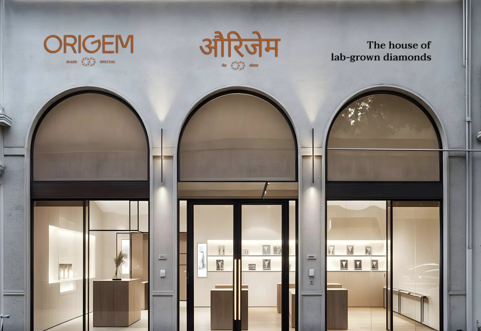
Origem is Goldiam’s house of lab-grown diamonds. The work covered its name, its brand strategy and its visual identity.

What we made
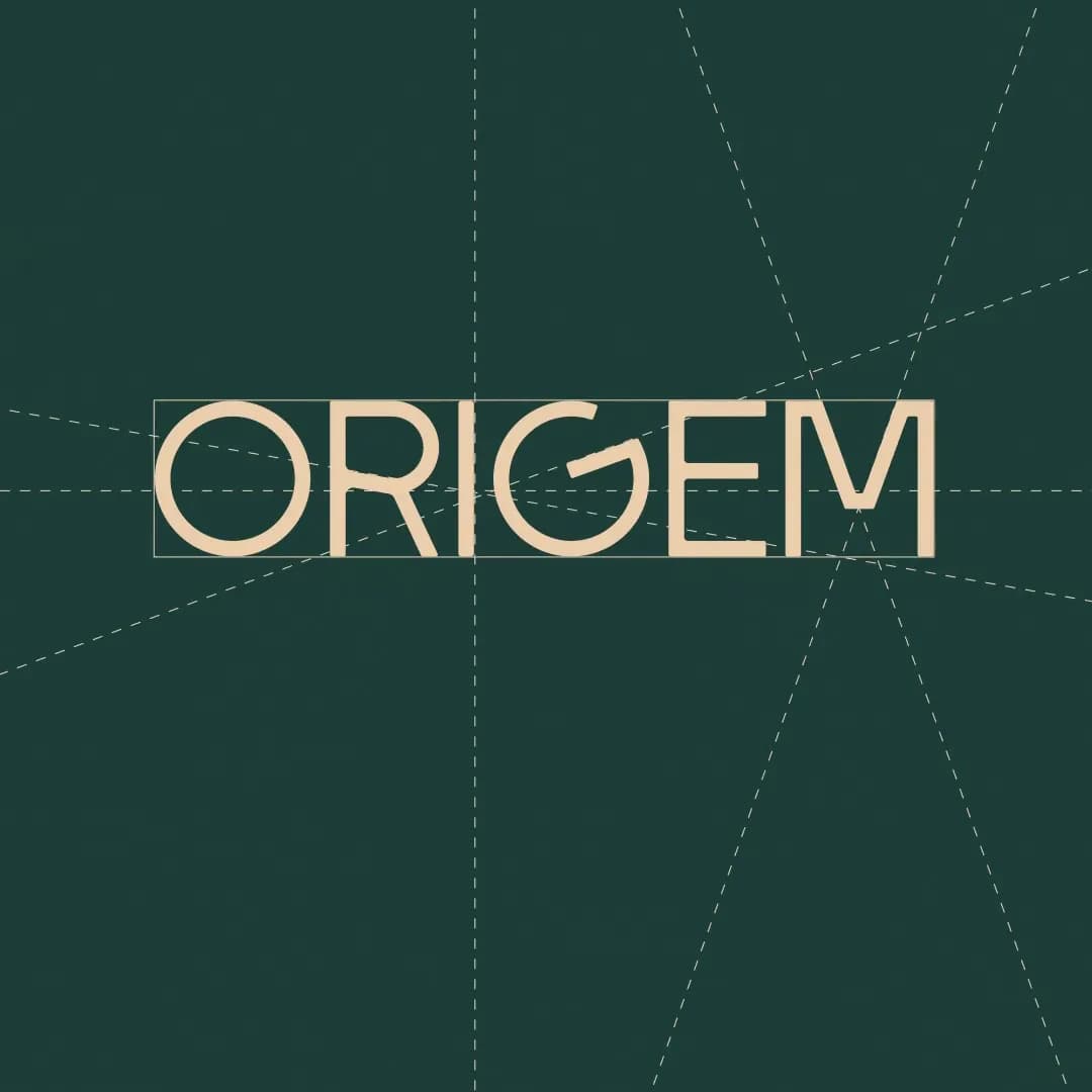
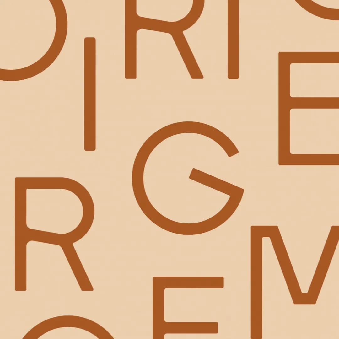
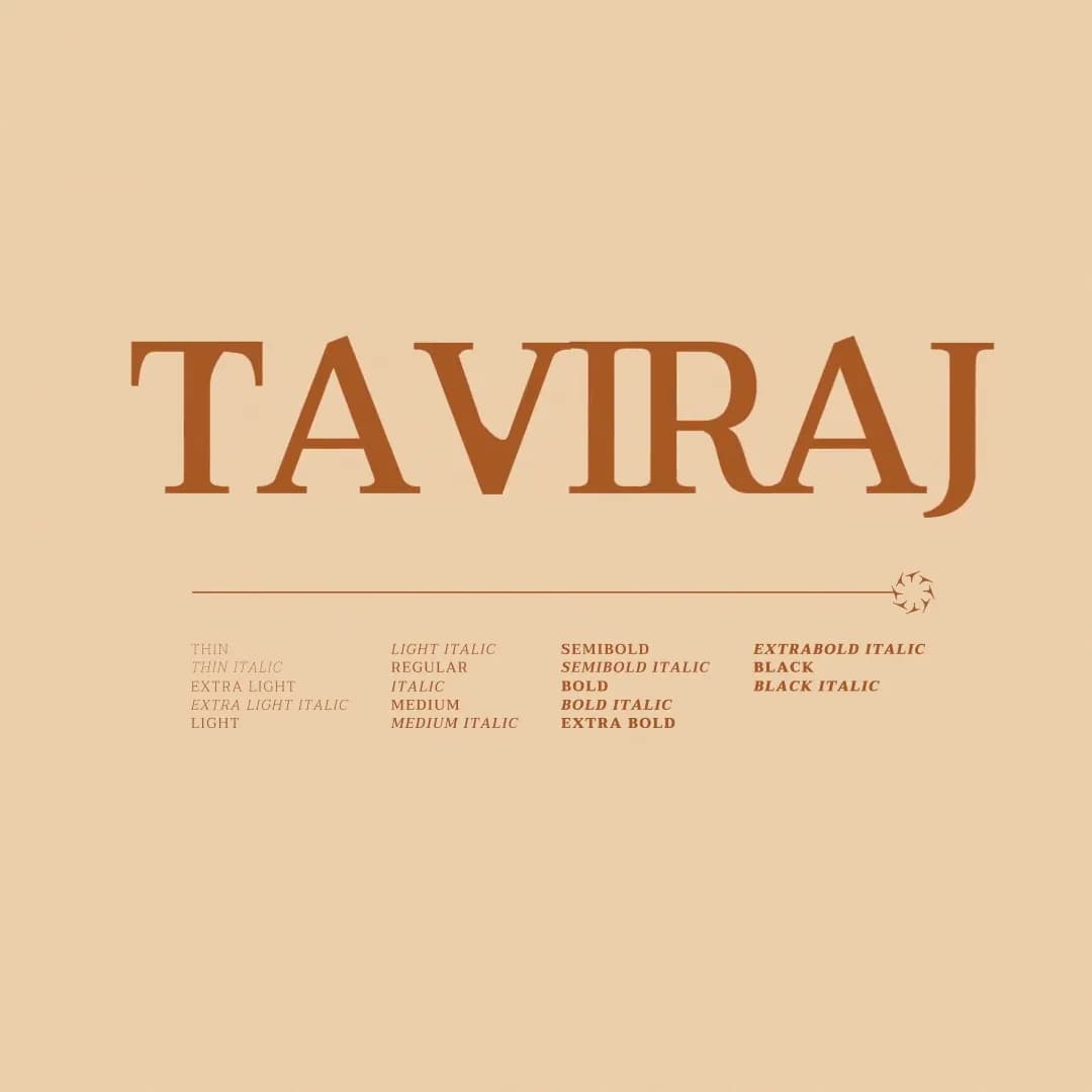
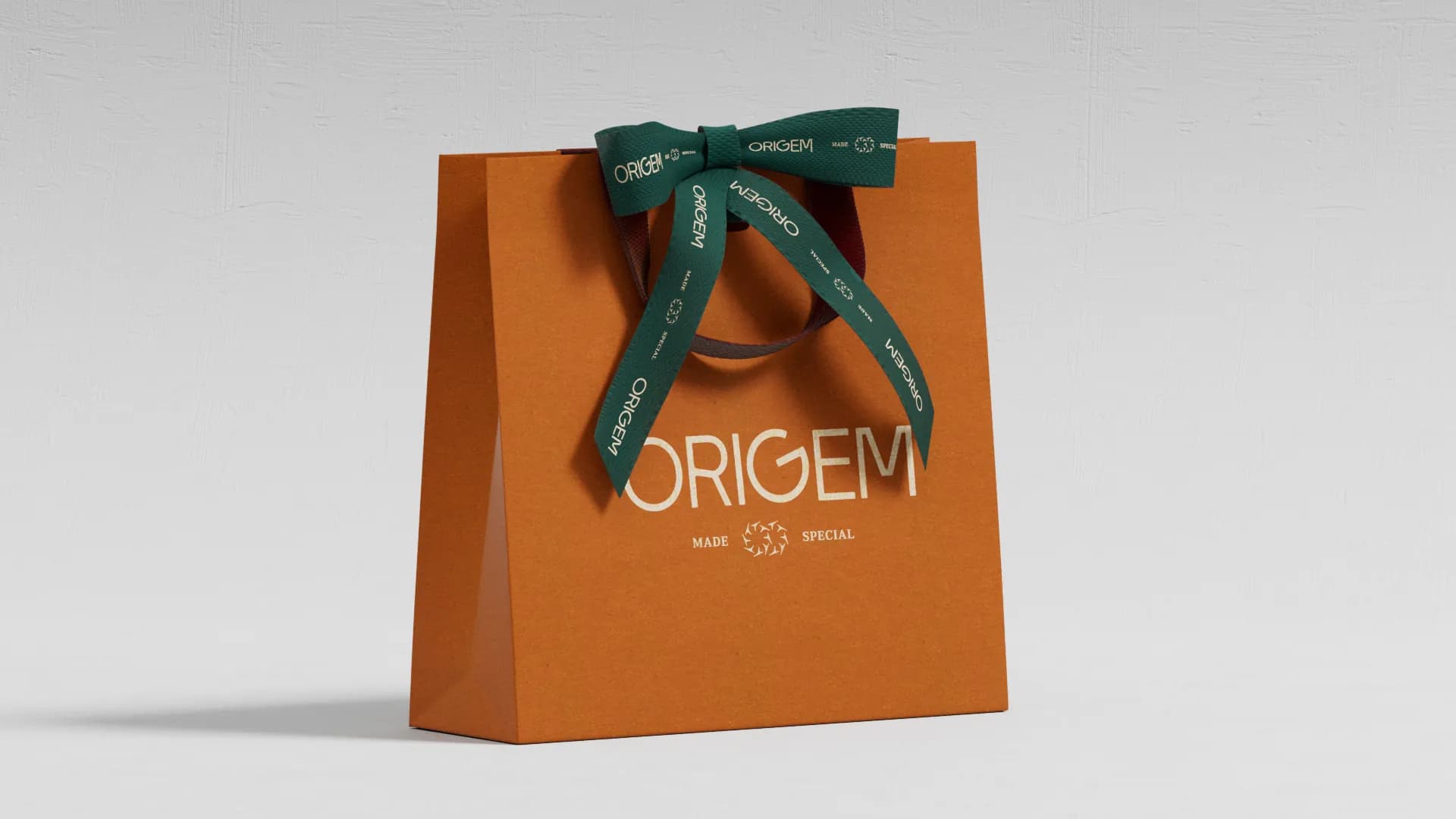
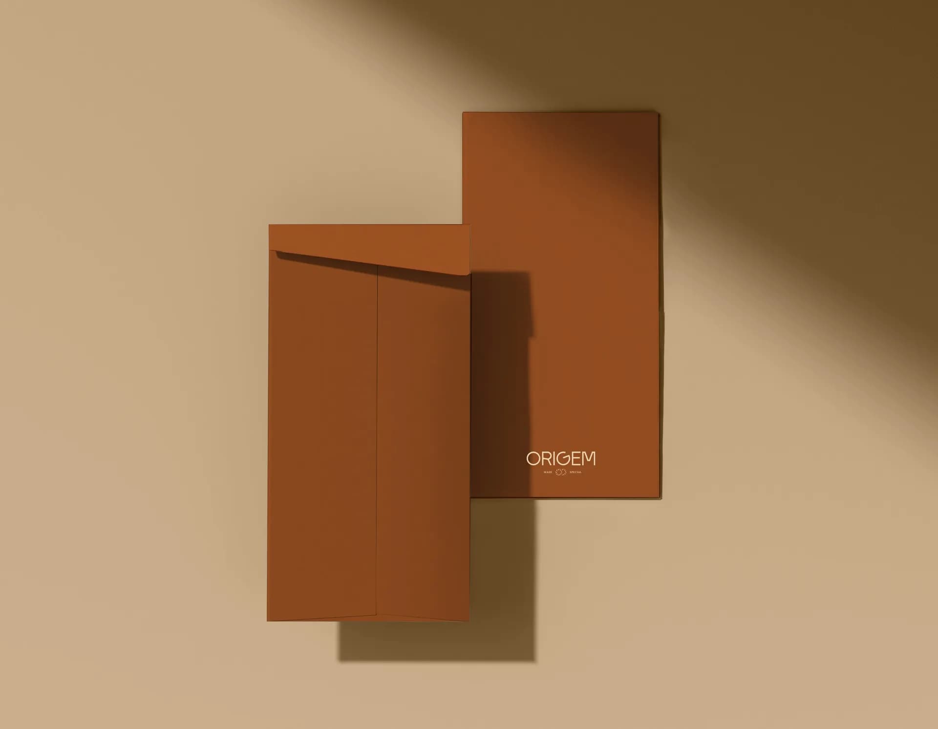
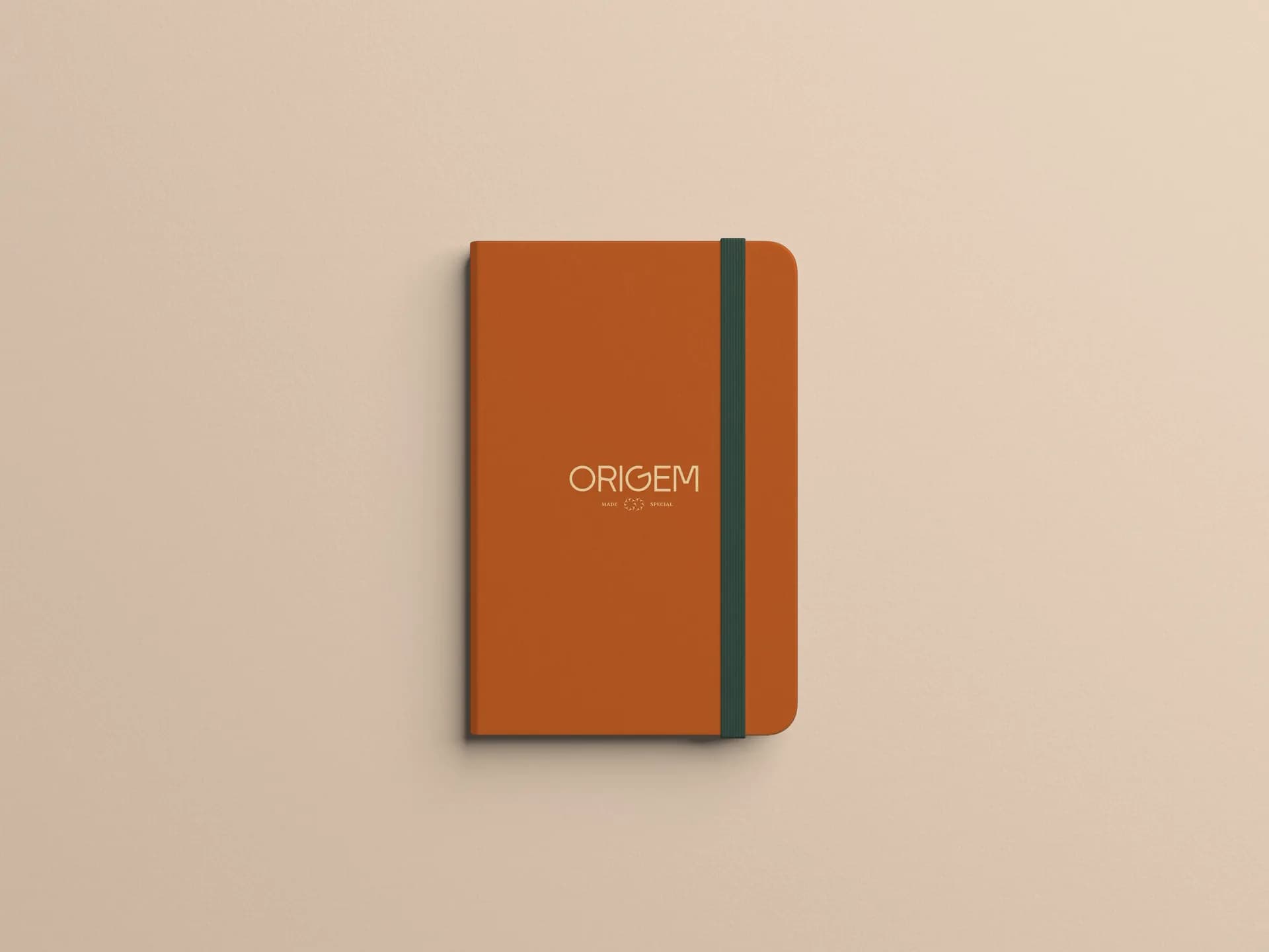
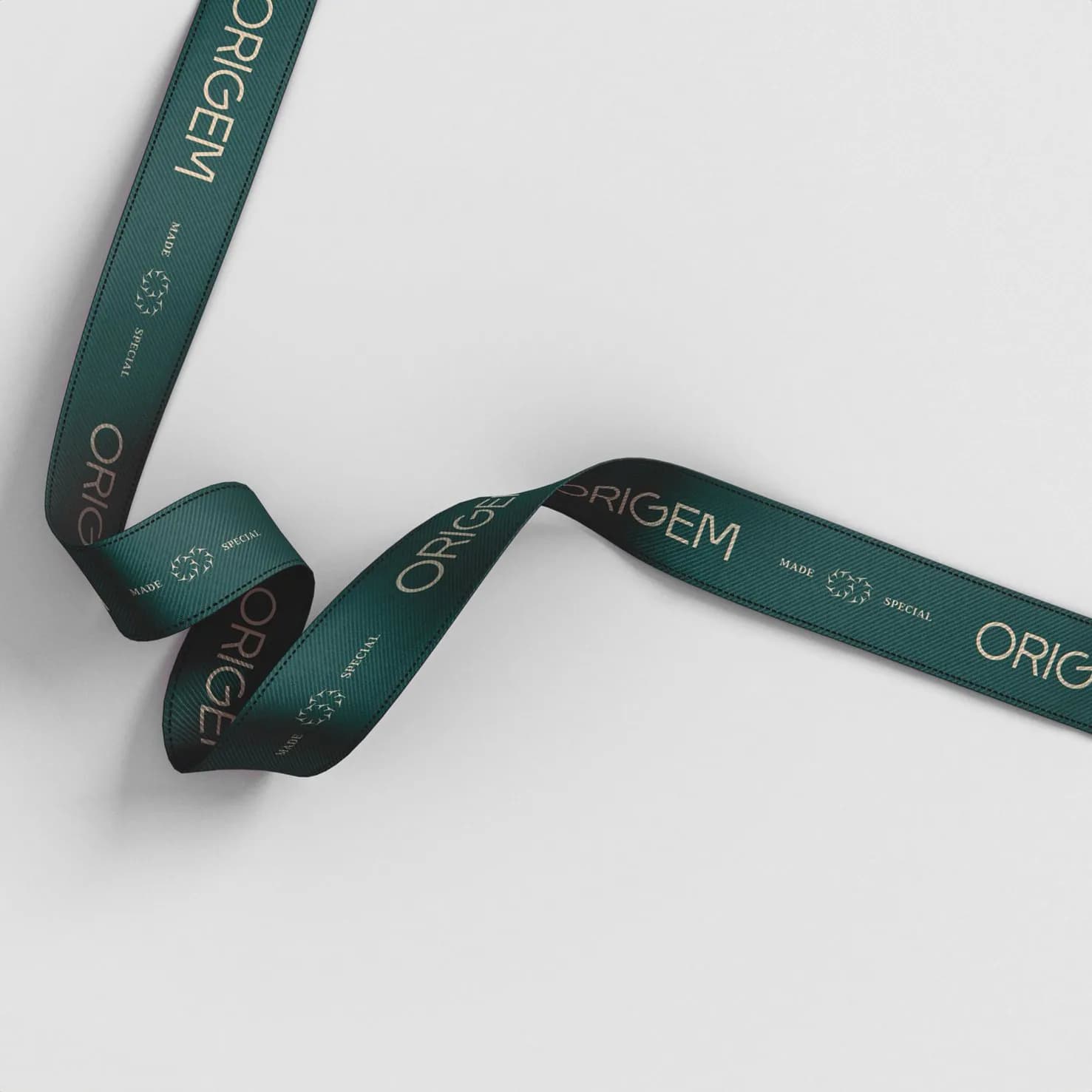
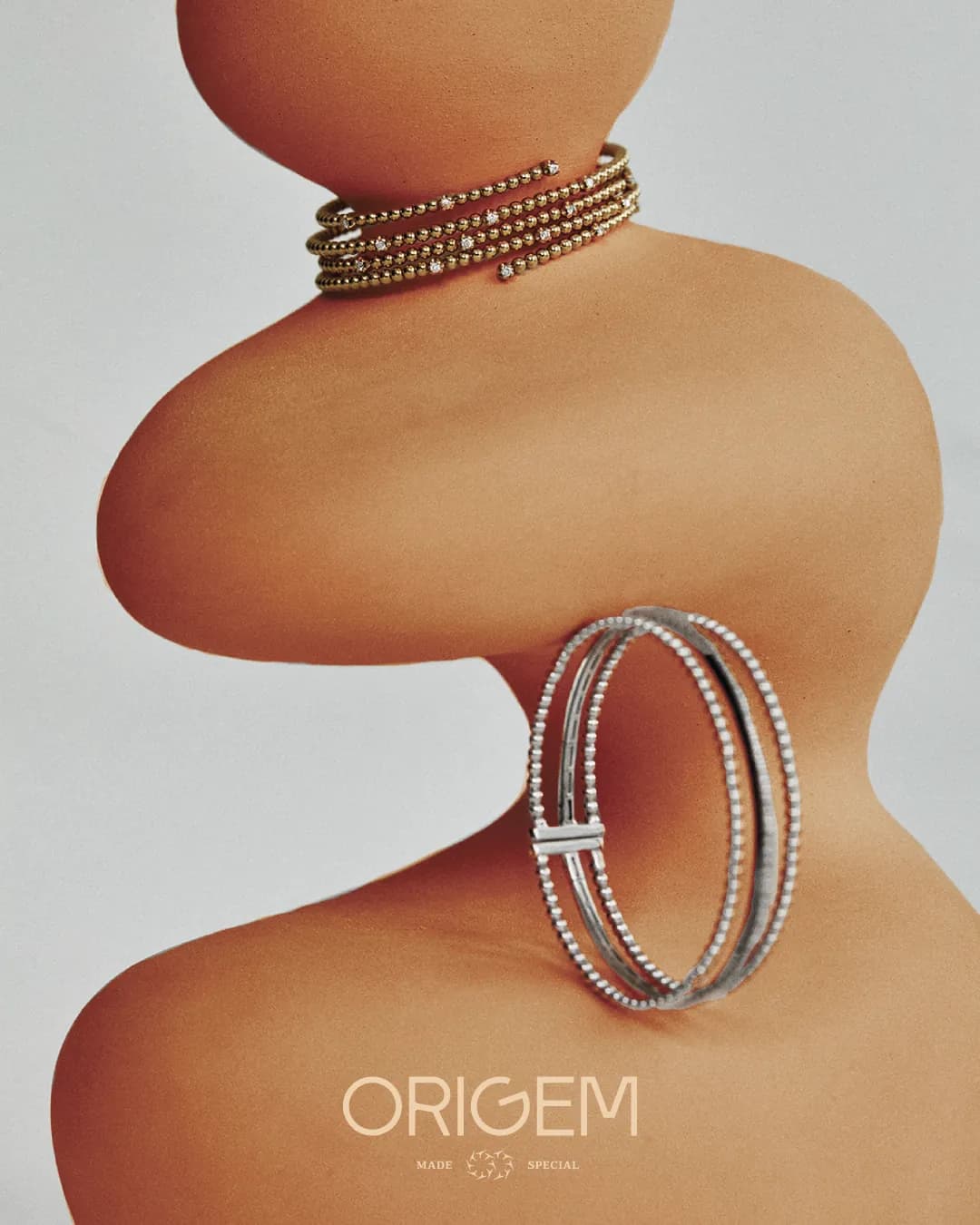
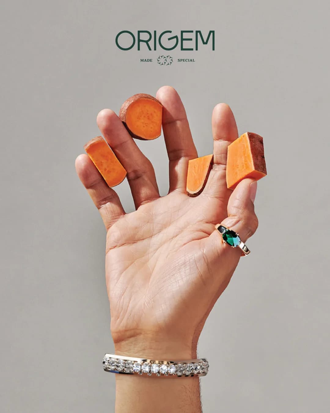
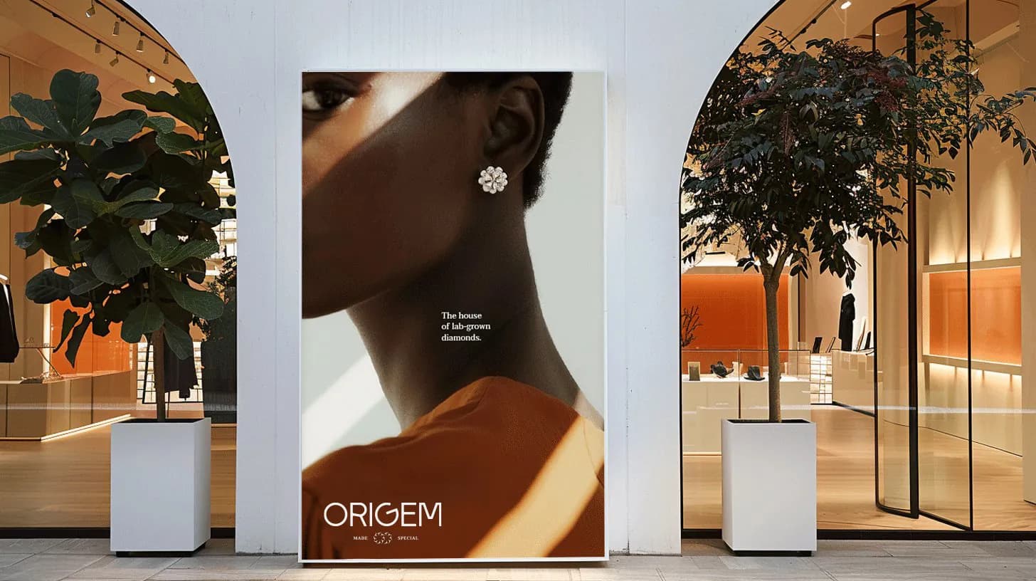
The name, a refined wordmark, serif typography in Taviraj and a palette of terracotta and deep green, then the brand in use: a storefront and a store standee, shopping bags, ribbon, envelopes and notebooks, a street billboard and a metro poster, campaign imagery, Instagram stories and a set of animations.
How we approached it
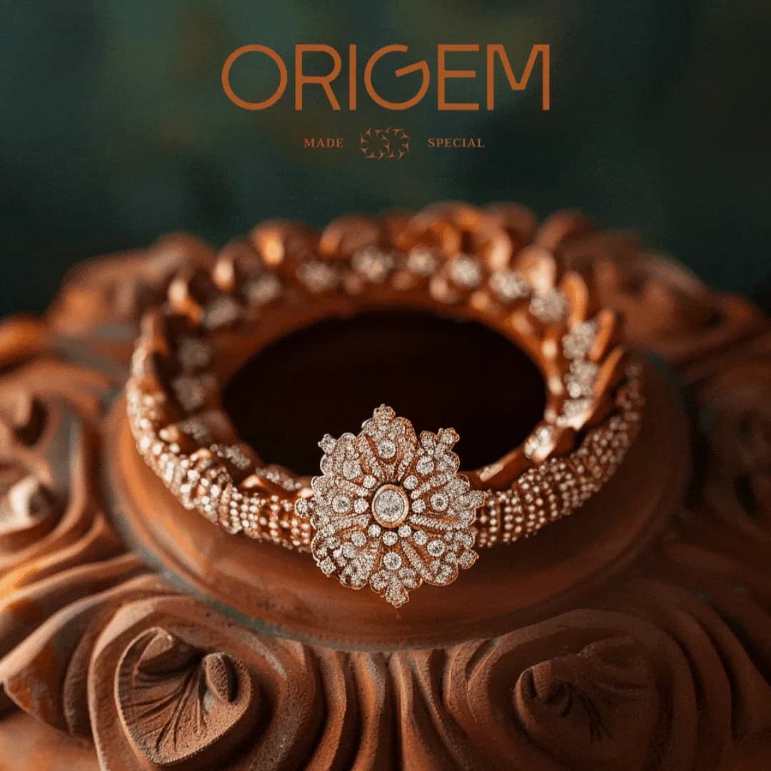
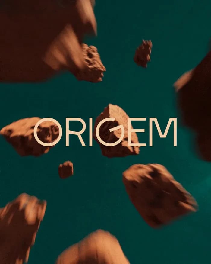
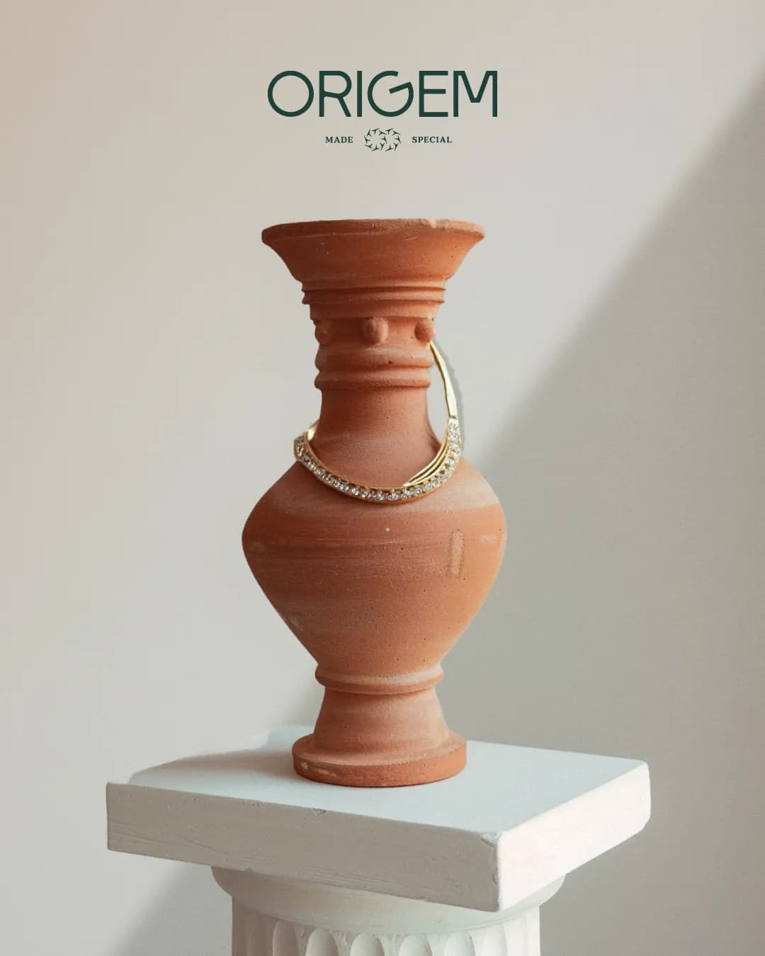
Earth and light. Terracotta rock and carved clay set off each piece of jewellery, deep green grounds the wordmark and the ribbon, and the motion work drops diamonds through light and floats terracotta rocks around the wordmark.
What’s on the page
- Logo reveal
- Poster series
- Wordmark animation
- Typography in Taviraj
- Colour palette
- Jewellery imagery and motion
- Floating rocks wordmark and banner
- Shopping bag and ribbon
- Envelope stationery and notebook
- Metro poster
- Instagram story
- Street billboard
- Storefront and store standee
- Campaign photography: necklace, bangles, rings