Brand
Setu
- Client
- Setu
- Services
- Brand Strategy
- Packaging
- Visual Identity
The brief
Setu makes sensible supplements for everyday needs. The work covered its brand strategy, its visual identity and its packaging.

What we made
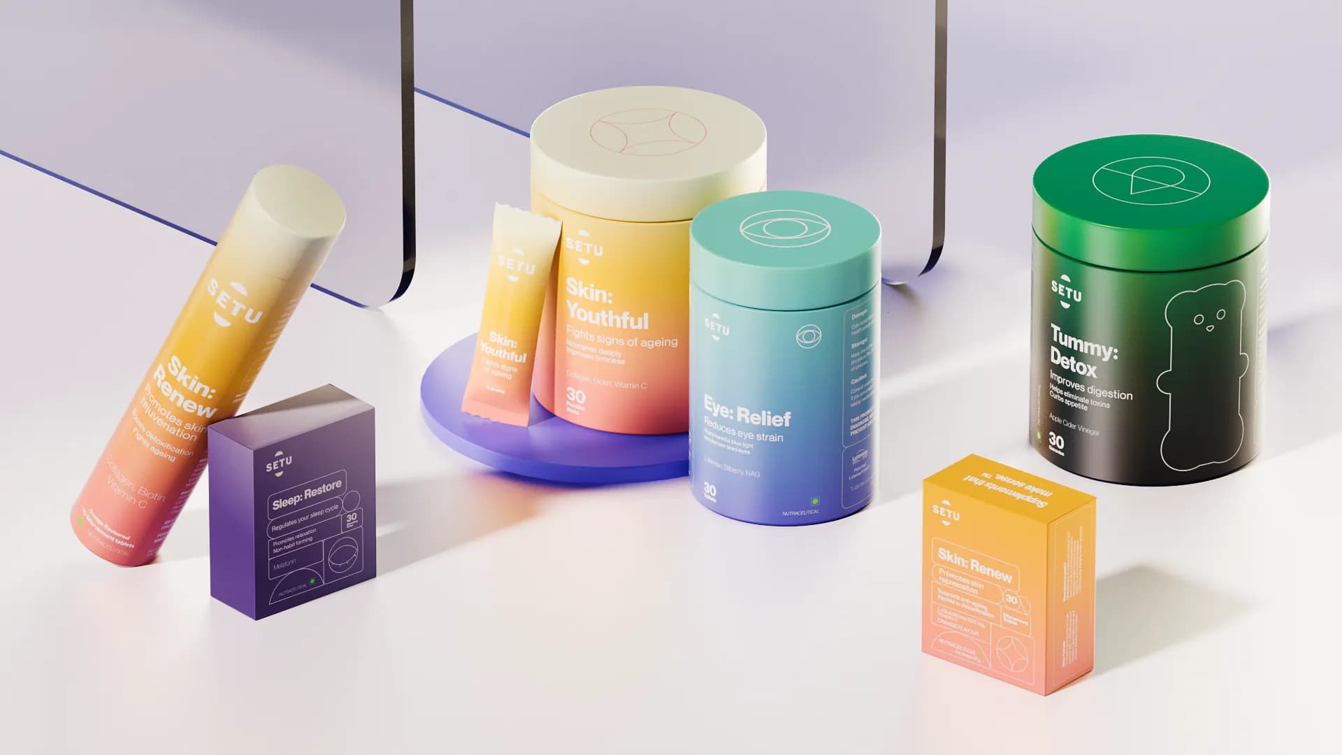
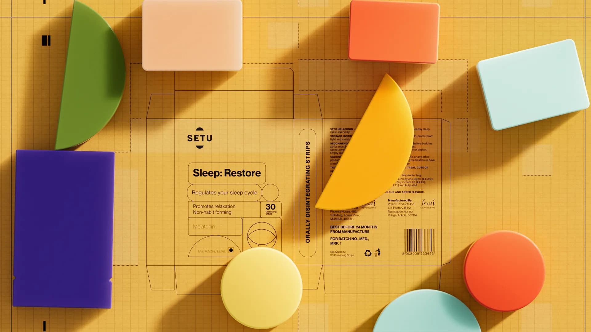
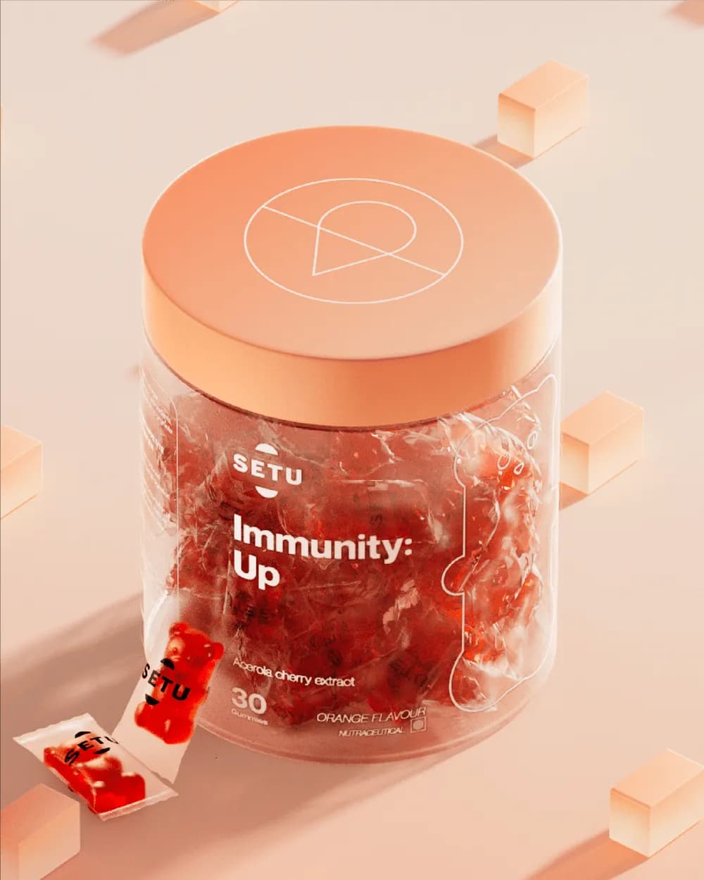
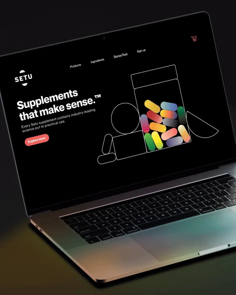
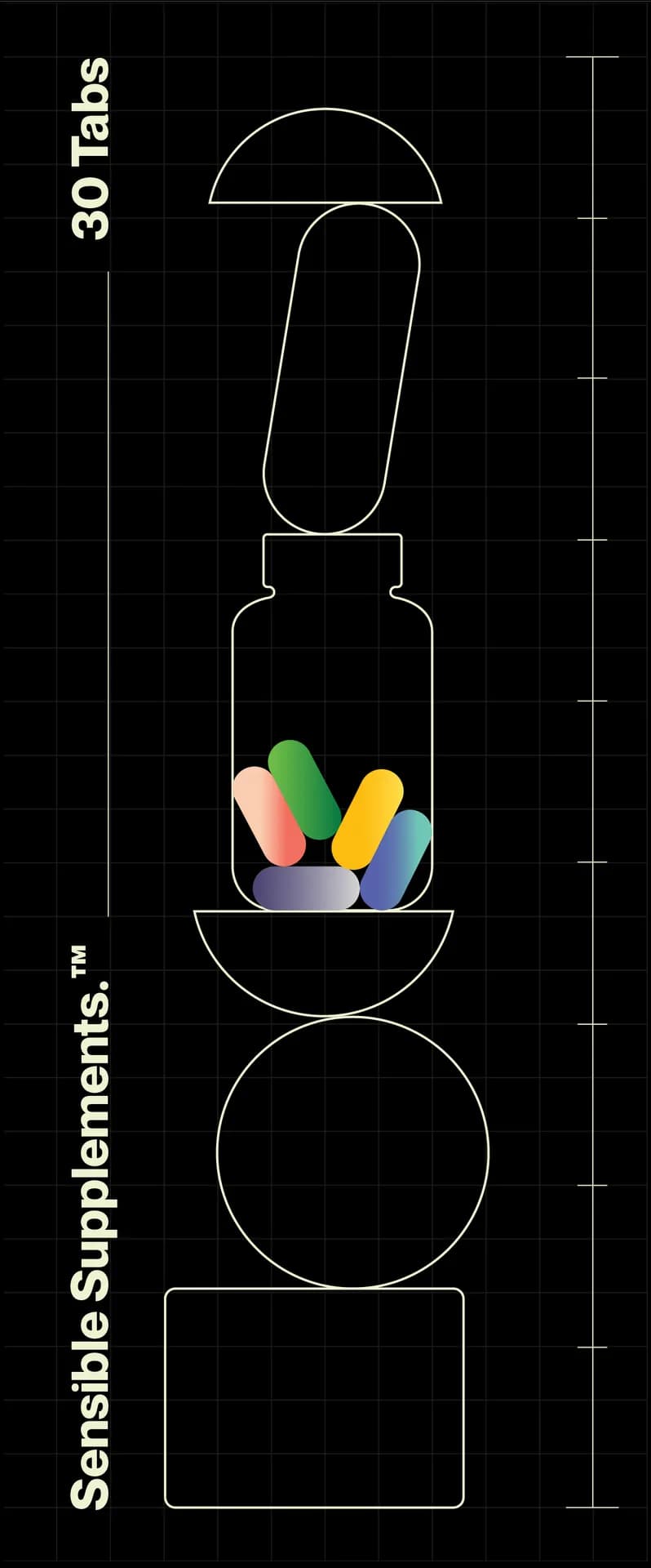
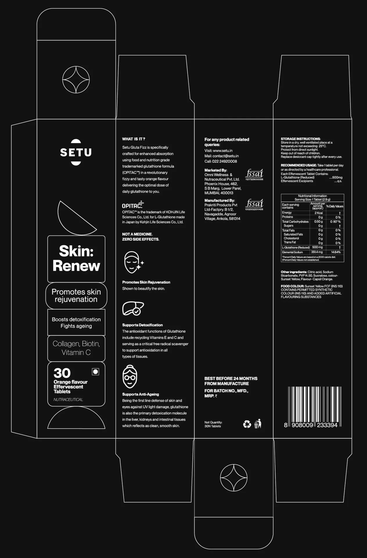
A packaging system across jars, sachets, tubes, gummies and boxes, each named for the need it serves: Sleep: Restore, Eye: Relief, Skin: Youthful, Immunity: Up, Tummy: Detox. Around it: box dielines, a “Sensible Supplements” poster, a website and a 28-second brand film.
How we approached it
Plain words and soft colour. Every product leads with a two-part label, the need first and then what it does, and soft gradients and geometric pill forms run across the whole range, from a sachet to the poster.
What’s on the page
- Brand film, 28 seconds
- Product range
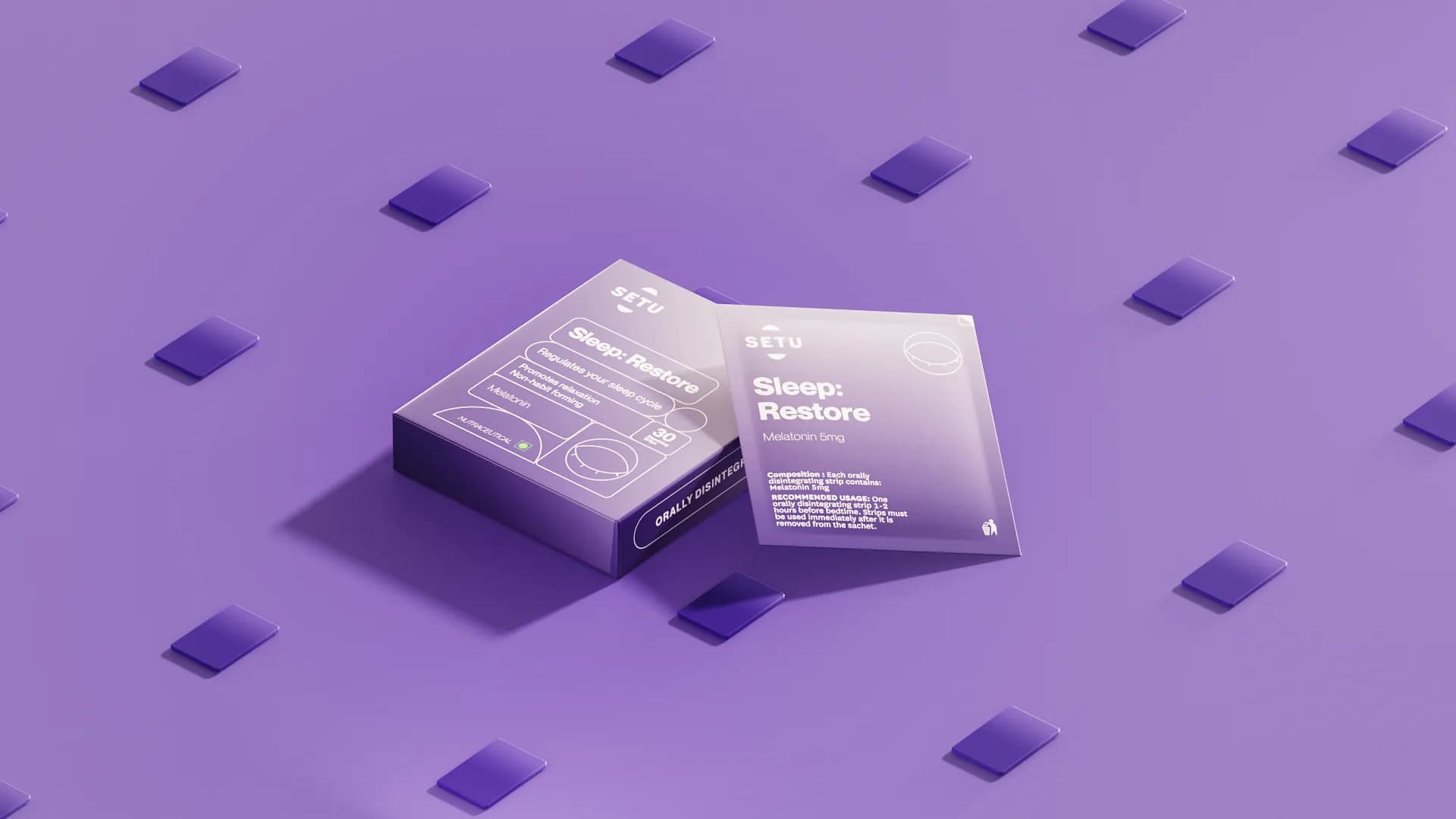
- Sleep: Restore sachets
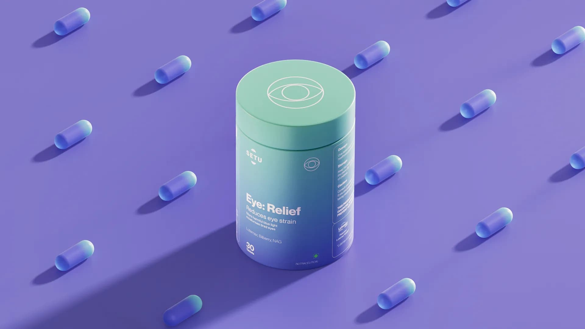
- Eye: Relief jar
- Box dielines
- Effervescent tube
- Skin: Youthful jar and sachet
- Immunity: Up gummy jar
- Website
- Tummy: Detox jar, animated
- “Sensible Supplements” poster